
New navigation for Team Services
In my blog post announcing TFS 15 RC1, I mentioned that we are working on a new navigation UI. In a somewhat unusual turn of events, it showed up in an on premises preview before it showed up in the cloud. Today we enabled the new navigation experience in Team Services, making it really easy for anyone to give it a try.
This new experience is VERY much a work in progress. We know lots of issues remain and are working on them but it’s time for us to start getting some meaningful feedback outside our own 4 walls.
To minimize disruption, we’ve disabled it by default for every Team Services user. You must take explicit action to enable it. Each Team Services user can enable it or disable it for themselves. Let me show you how…
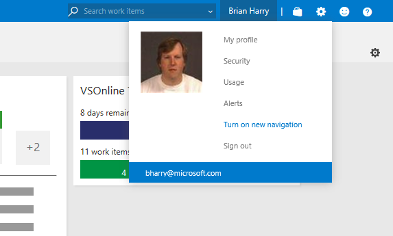
Let’s start with what the nav looks like today. Ignore the “Compliance” hub group – that’s an internal extension we use. You turn on the new navigation with a menu item on your user menu “Turn on new navigation”.
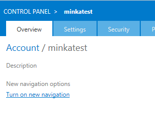
 Alternatively, the account administrator can enable it or disable it for the whole account using the account settings. Ultimately the user’s personal setting, once it’s been explicitly set, overrides the account setting.
 Once you’ve turned it on, the same Home screen I showed above looks like this…
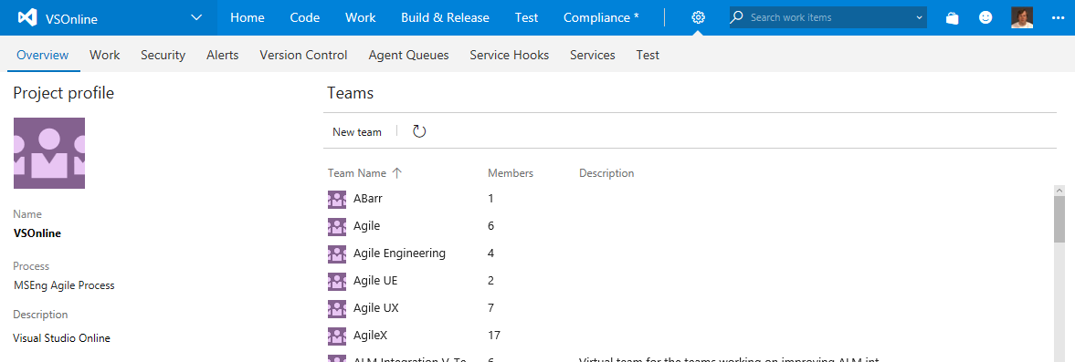
 Virtually every element of the nav has changed in some form. Some of the big things include…
- The lines of title/nav have been reduced from 3 to 2, giving back more vertical real estate to content.
- We’ve added menus to the top level hub groups to allow you to navigate directly to the hub you want rather than first going to the default hub and then the hub you want. We think this makes navigation more efficient.
- We’ve combined Build & Release into a single hub group because there’s so much overlap between them.
We also changed the top left navigation, simplifying it and giving easy access to things like “New Team Project” and “Account Settings”…
 We’ve also begun a major overhaul of the “Settings” experience – eliminating the parallel navigation universe of settings and merging them into the main navigation experience. This, we think, will help people not get “lost” in the settings experience.
 We hope you like the changes and we value any feedback or suggestions you have. Please use our send a smile feature (upper right), my blog, UserVoice, etc. to give feedback and make suggestions. One very important thing is that we’ve instrumented Team Services so we know when someone enables or disables the new navigation. In fact, if you disable it, the product will ask you why. I strongly encourage you to vote with your feet. If you like the new nav, use it. If you don’t, go back to the old one. One of the main success metrics we plan to use is the number of people who enable the new nav and leave it on. Anyone turning it off is a vote against the change. Once we feel good that the vast majority of people prefer the new nav, we’ll make it the default. At some point, down the road, we’ll remove the old navigation. By giving you control, we hope to minimize the disruption of this pretty substantial change for you.
Really looking forward to your feedback.
Brian
We hope you like the changes and we value any feedback or suggestions you have. Please use our send a smile feature (upper right), my blog, UserVoice, etc. to give feedback and make suggestions. One very important thing is that we’ve instrumented Team Services so we know when someone enables or disables the new navigation. In fact, if you disable it, the product will ask you why. I strongly encourage you to vote with your feet. If you like the new nav, use it. If you don’t, go back to the old one. One of the main success metrics we plan to use is the number of people who enable the new nav and leave it on. Anyone turning it off is a vote against the change. Once we feel good that the vast majority of people prefer the new nav, we’ll make it the default. At some point, down the road, we’ll remove the old navigation. By giving you control, we hope to minimize the disruption of this pretty substantial change for you.
Really looking forward to your feedback.
Brian
 Light
Light Dark
Dark
0 comments